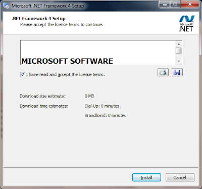
I was installing Microsoft.NET Framework 4.0 tonight and I couldn't help wonder something. Is this the best UI Microsoft could come up with? Seriously, this text control only shows 1 of 44 lines in the EULA. Yet look at all that empty space down at the bottom of the dialog.
Is this for real?

